


QR codes can now be stylish and on-brand. They’ve transformed from basic black-and-white squares to branded, interactive design features that make user experiences more engaging and elevate brand presence. The key is achieving a happy medium.
A QR code that is visually appealing, but doesn’t scan, is counterproductive. A plain and functional code may look too boring long enough to waste a marketing opportunity. An effective QR code encompasses a beautiful aesthetic while also being functional – no matter where it’s being placed. Let’s take a look at how to strike that balance.
1. Start with Purpose and Context
Before jumping into the fun part of designing, first consider what a successful QR code is going to do for your customers.
Do you want to send them to your website, product page, feedback form, or digital menu? Where will this QR code live? On the bottom of your packaging, a billboard, on someone’s business card.
This context allows you to identify the right size, contrast, error correction level, and placement. A code on a product label, for example, will require different considerations than a code on a large outdoor banner. The important part is that your QR code is visible, scannable, and appropriate to its setting.
2. Size and Placement is Important
Size may sound trivial, but it’s one of the biggest contributors to QR code failure in the real world. The general rule is the farther users are from the code, the larger it should be.
If it’s on a poster, make sure to keep it large enough to scan easily and comfortably from that distance. For smaller formats like flyers or business cards, make sure it’s at least 2 cm x 2 cm.
You also want to leave enough white space (called the “quiet zone”) around the QR code as well, so the camera can easily detect it.
Placement is equally as important. You want to avoid placing it in the corner, inserts/folds, or against a busy background. You want to place it where users will see it naturally at (eye level) or in the area where their attention typically settles.
3. Color and Contrast: No Brand Compromise
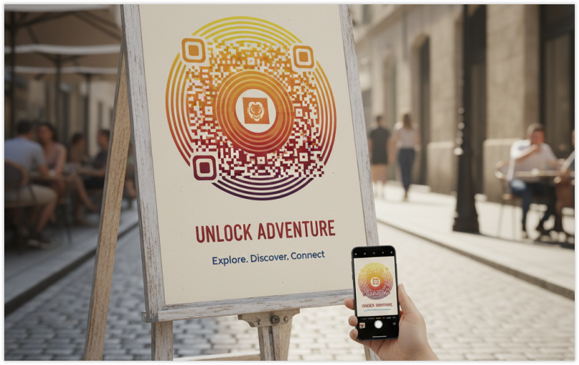
Adding color to your QR code can certainly make it pop and match your brand, but contrast may still be paramount.
Use a darker foreground on a lighter background. Fewer scans are achieved with the reverse (lighter code on dark ground). Gradients and textures can look great, as long as they do not impact the scanned output.
If you will embed a logo into the QR code, keep it small, and place it out of the way of the important data pattern. Finding this equilibrium will keep your QR code attractive, as well as functional.
Be sure to scan your QR code on multiple devices and lighting conditions for proper scanning response after any adjustment to the custom design.
4. Customizing Too Much
Custom QR codes can easily take QR codes to the next level with brands incorporating their logo, as well as brand colors, or even text, like “Scan to learn more“. These elements tie the QR codes to the overall design instead of something additional to an item.
However, too much customization can limit the scan-able output. Avoid complex shapes made in too many formats, overcomplicated patterns do not always yield scanning success, nor do distorted corners either. The three square positioning elements (the larger squares at the corners) should continually be visible because they influence recognition and scanning.
In general, a simple design with thoughtful brand elements typically illustrates better scanning performance than a complicated, over-engineered effort that will confuse a camera.
5. Materials, Printing, and Real-World Conditions
Designs often look perfect on the screen but fail when printed or projected into the real world. Surface, lighting, and finish all impact QR code performance. If the QR code is printed on a glossy substrate, light refraction may cause the code to fail scanning. Glare should always be avoided, wherever possible, by using light matte finishes. Avoid uneven, curved, or textured materials which may disturb the design.
Use high resolution vector formats such as SVG or EPS when printing designs. Pixelated or out of focus images will cause reliability issues with scanning.
Finally, test the printed version in real conditions under sunlight, artificial light, or any other angle introduced to verify it works at every location.
6. Keep It Simple: Use Dynamic QR Codes

The more data embedded in the QR code, the density increases making the codes less scannable and more complicated to scan. To keep it simple, utilize shortened URLs or replace static QR codes with dynamic QR codes entirely.
Dynamic QR codes let you edit the destination afterward, even after you’ve printed it, while also providing analytics giving you data on each scan, location, and type of device used.
From a design standpoint, dynamic QR codes look cleaner and are easier to scan because they contain less data. That’s a considerate design direction on both visual appeal and efficacy.
7. Quick Checklist for QR Code Design
Before you publish or print, go down this checklist:
- The purpose is clear and relevant.
- The QR code is appropriately sized for the environment.
- There is sufficient clear space (quiet zone) around the code.
- There is a high degree of contrast between foreground and background.
- Any logo or branding does not disrupt the data pattern.
- Printing material and finishing allow for easy scanning.
- You have tested on many devices and lighting situations.
You are using a dynamic QR code if needed for flexibility and/or analytics.
If you can check all those boxes, you have designed a QR code that is reliable.
8. Why Design Still Matters in QR Codes
With QR codes in 2025 and beyond, they are no longer just a quick solution in a toolbox; they are part of a brand’s visual identity.
When you place a thoughtful QR code, it expresses your care for the details and for the user experience. It encourages interaction, builds trust, and creates a natural bridge between the physical and digital experience.
When someone sees a clean, properly positioned, and branded QR code, they develop greater intention to engage. Then, once they scan the QR and it opens instantly, that’s a small but meaningful moment of satisfaction and those moments help create positive associations with your brand.
Final Thoughts
Good QR code design is about a happy medium in quality of attractiveness and functionality. Make it attractive enough to attract attention, but functional enough to assure performance.
Always test each use-case and version before putting it into the world. It’s important to keep in mind, simple usually beats out over complicated. If QR design is done right, the QR code becomes more than a link; it becomes a trustworthy interactive bridge between your brand and your user.
So the next time you create a QR code, think about it as being part of your larger design scheme, not just a “utility.” If your QR code is attractive enough, functions correctly, and looks good in your brand design scheme, you’ve conquered QR experience design.
FAQ
1. How can I make my QR code look good while not ruining the scanability of the QR code?
Keep the contrast of the foreground/background distinct, avoid complex shapes, and always test the code after you have changed the design.
2. Can I use my brand colours in my QR code?
Yes! As long as there is enough contrast (i.e., dark for QR code and light for the background), colours are likely fine and scanning shouldn’t be inhibited.
3. Will my logo ruin the performance of my QR code?
Possibly if part of the logo is covering important areas of your QR code. Make sure to keep your logo small and centered, and to not cover or block the three large squares that position your code.
4. What is the best QR code size for print?
A minimum of 2 cm by 2 cm for small prints. For a poster or display, use a size that allows you to scan your QR code from a reasonable distance.
5. What are the advantages of a dynamic QR code compared to a static QR code?
A main benefit is the ability to edit, track, and a dynamic QR code is cleaner. Dynamic QR codes are the best in design, flexibility, and ease of scanning.